UNCOMMON GOODS
BRANDING
WEB DESIGN
STRATEGY
BRANDING
WEB DESIGN
STRATEGY
WHAT IS IT
Uncommon Goods is a place to discover hand-picked, creative designs by independent artists and makers. The brand wants to make it easier and more ethical than ever to shop for unique gifts from independent makers and businesses so that you can feel good about giving.
THE ASK AND SOLUTION
We took the brand through a visual and verbal transformation that captures the attention of a changing audience and eventually drives repeated purchase + builds loyalty over time. As we developed the re-branding, we focused on bringing the following fundamental beliefs to life:
Creativity: Foster sharable moments of inspiration.
Inclusivity: Create an inviting place for people of all stripes.
Discovery: Delight at every turn & defy expectations.


BRAND
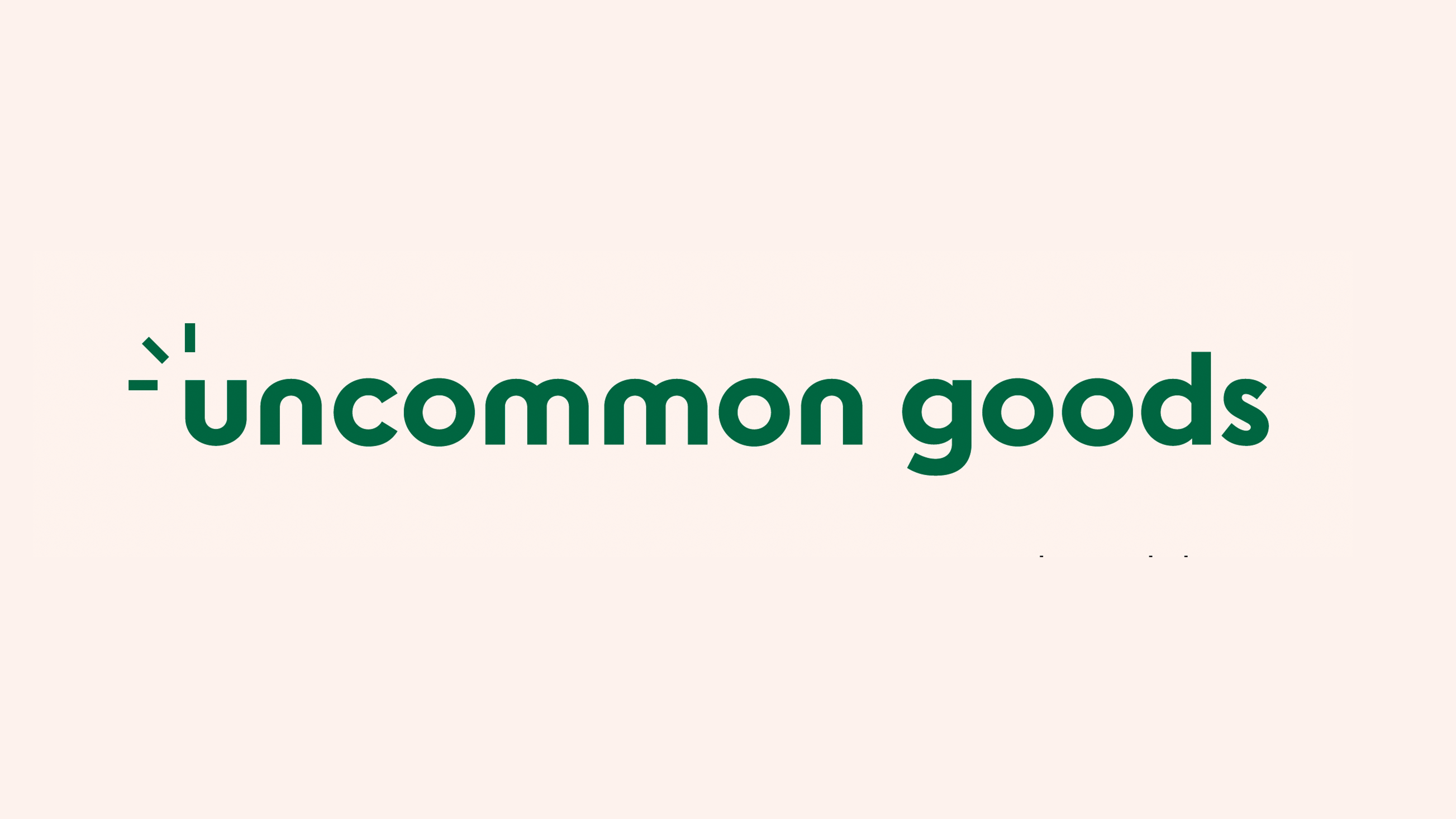
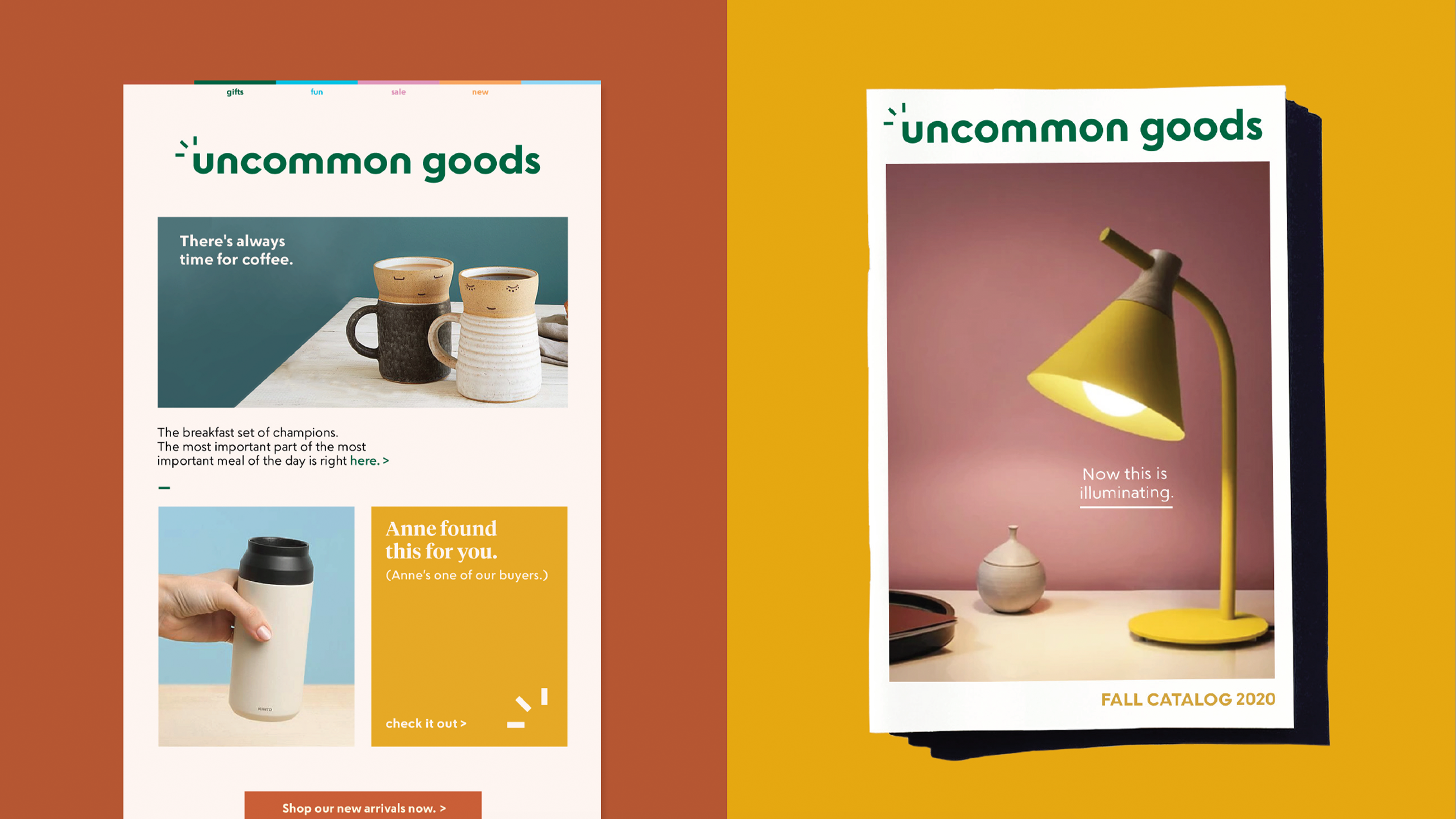
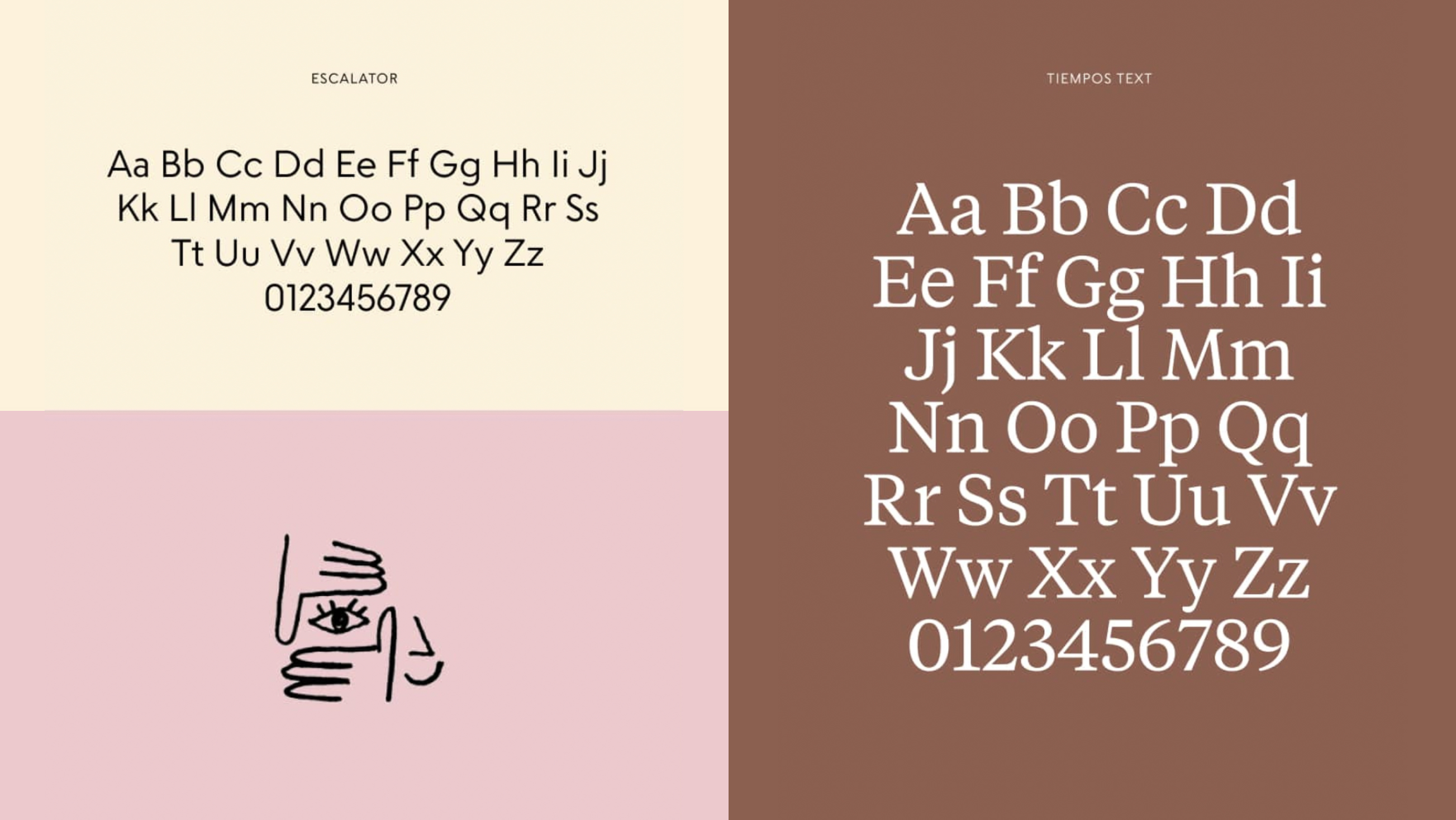
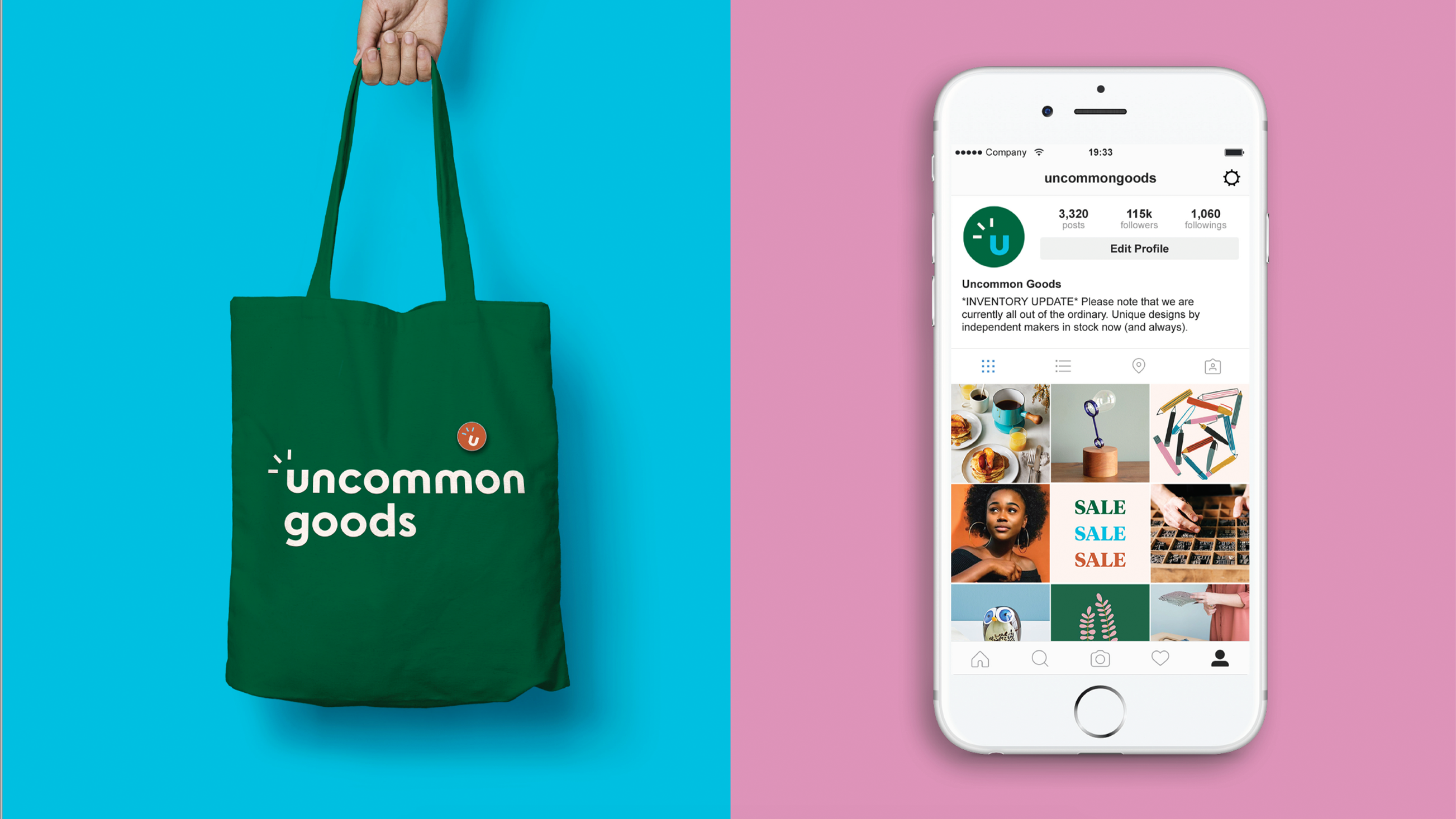
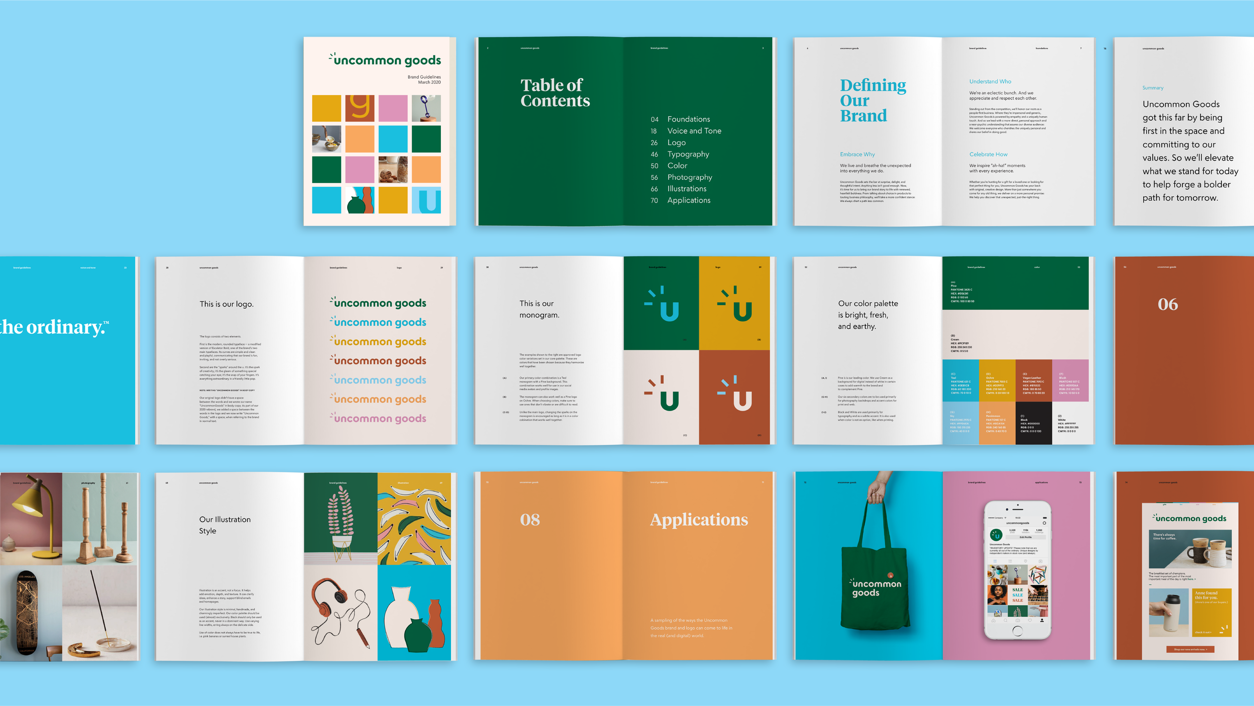
The logo consists of a rounded typeface — Its curves are simple and clean and playful, communicating that the brand is fun, inviting, and not overly serious. The “sparks” around the u represent the spark of creativity; it’s the gleam of something special catching your eye. The color palette is bright, fresh, and earthy. Photography creates a visual experience that communicates quality and a distinct brand aesthetic.
The logo consists of a rounded typeface — Its curves are simple and clean and playful, communicating that the brand is fun, inviting, and not overly serious. The “sparks” around the u represent the spark of creativity; it’s the gleam of something special catching your eye. The color palette is bright, fresh, and earthy. Photography creates a visual experience that communicates quality and a distinct brand aesthetic.
TANYA PEDRA 2024 ALL RIGHTS RESERVED.



 Featured in: